Your Website Isn’t a Museum. Stop Displaying Everything at Once
If your homepage looks like a car boot sale, we need to talk...
Let’s get this out of the way…
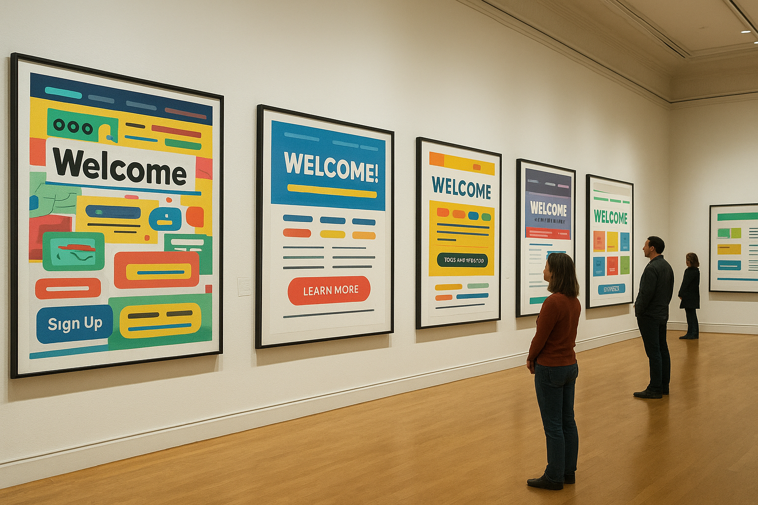
Your homepage is not the British Museum.
You are not curating an exhibition.
Your visitors do not want a guided tour of “Every Single Thing You’ve Ever Done Since 2015”.
They want clarity.
They want direction.
And most importantly—they want one job to do, not seventeen.
Yet so many websites try to squeeze in:
Every service
Every testimonial
Every project
Every team member (including the cat)
Every award since primary school
A slideshow that hasn’t changed since 2018
…and then wonder why nobody clicks anything.
Welcome to De-sigh-n, where we take a deep breath, sigh heavily, and fix it.
Why Overstuffed Homepages Don’t Work
When your homepage tries to say everything, visitors hear nothing.
Here’s what actually happens:
1. Choice overload kicks in
The human brain hates making decisions.
Give people 20 options and they’ll pick the easiest one every time:
leaving.
2. Your key message gets buried
If your “Main Thing” is hiding between “Latest News” and “Our Values (13 Bullet Points)”… congratulations, it’s invisible.
3. You look less trustworthy
Clutter = confusion
Confusion = hesitation
Hesitation = no enquiry
It’s not aesthetic - it’s psychology.
4. You look like you have no idea what your customer actually wants
And people buy from businesses that seem to “get them”.

Your Homepage Has One Job
Just one.
→ Tell people what you do and get them to take the next step.
That’s it.
Not “introduce them to your whole universe”.
Not “impress them with your 47 service categories”.
Not “show them your team Canva collage”.
If your homepage isn’t doing that, it’s working against you.
How to Fix a Museum-Homepage (Without Crying)
1. Pick ONE primary action
What do you actually want people to do?
Book a call?
Fill in a form?
Download something?
Buy?
Choose one.
Everything else is supporting cast.
2. Lead with your outcome, not your autobiography
No one needs your life story.
They need:
“Here’s what we do, here’s who it’s for, here’s why it helps.”
Fast. Clear. Human.
(By the way, still tell your story, it helps to build trust and relatability, just not at the top of your homepage).
3. Cut your navigation down to essentials
If your menu has more than 6 items, we’re now in “car boot sale” territory.
Keep:
Home
Services
Work
About
Contact
Everything else can go in the footer where it belongs.
4. Give each section a purpose
Every block on your homepage should answer ONE question:
What do you do?
Who is it for?
Why should someone trust you?
What’s next?
If a section doesn’t do any of these?
Delete it.
It’s emotional baggage at this point.
5. Put your best work where people actually see it
The top of the page is not the place for a poetic mission statement.
Swap:
“We are passionate about innovation and committed to excellence.”
for:
“We build websites that actually bring you customers.”
You’ll instantly see the difference.
(Don’t worry, we’ve made the same mistake before)!

The Bottom Line
A great homepage doesn’t show everything you’ve ever made.
It shows the right things in the right order so people stick around long enough to care.
Minimalism isn’t “design snobbery”.
It’s respecting your visitor’s attention span… which is roughly 0.3 seconds on a Monday morning.
Need help un-museum-ing your homepage?
You know where to find us.
We can turn your cluttered digital exhibition into something clean, clear, and actually designed to convert.